

Staring at a screen for hours? You might be sabotaging your vision without even knowing it. The best monitor brightness and contrast settings aren't just about making your display look pretty—they're critical for protecting your eyes and boosting productivity. Whether you're gaming, working, or editing content, getting these settings right can be the difference between comfort and chronic eye strain.
Most monitors ship with factory settings cranked up to showroom levels—way too bright for everyday use. These default configurations force your eyes to work overtime, leading to headaches, fatigue, and long-term vision problems. The good news? A few simple adjustments can transform your viewing experience. This guide reveals exactly how much brightness and contrast for a monitor is good for eyes in every scenario.
Why Brightness and Contrast Matter for Your Eyes
Your eyes work hard to adjust to different lighting conditions. When your monitor is significantly brighter or dimmer than your surrounding environment, your eyes must constantly adapt, leading to fatigue. This is a primary cause of Computer Vision Syndrome (CVS).
Contrast controls the difference between the darkest black and the brightest white on your screen. If the contrast is too low, the image looks flat and gray, forcing you to squint to read text. If it is too high, details in bright areas get "blown out," causing glare.
A common question we receive is: how much brightness and contrast for a monitor is good for the eyes? The answer depends largely on your ambient lighting, but generally, your screen should match the brightness of a piece of white paper held next to it.

Recommended Brightness and Contrast Settings
While every panel is different, the recommended brightness and contrast for monitor configuration vary significantly based on your environment and usage scenario. Here are tailored settings for different situations to help you find the best brightness and contrast settings for your monitor in your specific case.
Indoor Office Environment (Moderate Lighting)
This is the most common scenario for daily work. With typical overhead lighting or desk lamps, your monitor should balance comfort and clarity.
- Brightness: 40-60% (120-150 nits)
- Contrast: 60-70%
- Color Temperature: 6500K (Warm or Low Blue Light mode recommended)

Dark Room / Night-Time Usage
When working in low ambient light, excessive brightness can cause eye fatigue and disrupt your sleep cycle. Ask yourself how much brightness and contrast for the monitor is good for the eyes when the room is dark.
- Brightness: 20-30% (80-100 nits)
- Contrast: 50-60%
- Tip: Enable Night Light or blue light filter to reduce eye strain

Bright Room / Near Windows (High Ambient Light)
If your desk is positioned near windows or in a sunlit room, you will need to increase brightness significantly to combat glare and maintain visibility.
- Brightness: 70-90% (200-250 nits)
- Contrast: 65-75%
- Tip: Consider anti-glare screen protectors or repositioning your monitor away from direct sunlight

Gaming Setup
Gamers prioritize visibility in dark scenes and smooth motion. The best brightness and contrast settings for monitor reddit communities often recommend slightly elevated levels.
- Brightness: 60-80% (150-200 nits)
- Contrast: 70-80%
- Tip: Avoid "Dynamic Contrast" modes that cause flickering; use Game Mode presets if available

Content Creation (Photo/Video Editing)
Professionals need accurate color representation. The recommended contrast for monitor work in this field should prioritize consistency over visual "pop."
- Brightness: Fixed at 120 nits (typically 45-50%)
- Contrast: 50% (native panel contrast, no enhancement)
- Color Mode: sRGB or Adobe RGB, depending on your workflow
Regarding what the correct brightness and contrast for a monitor are, the key principle is matching your screen brightness to your ambient environment. Your monitor should not appear as a glowing light source nor look dim and washed out compared to the room around you.
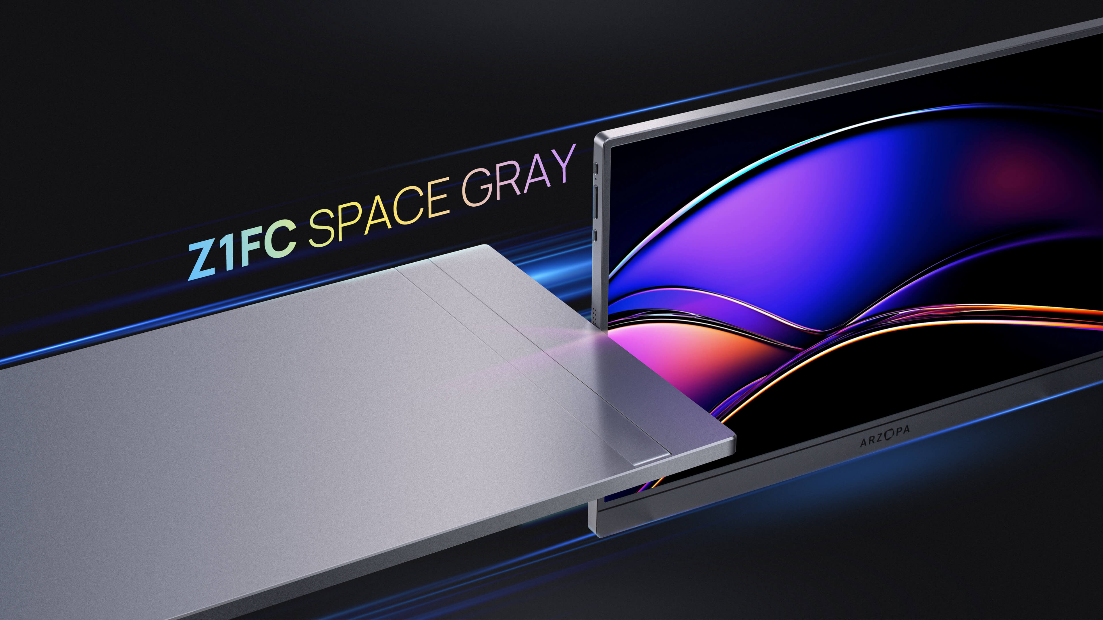
The Arzopa Advantage: Color Accuracy and Portability
Achieving these settings is much easier when you start with a high-quality panel. This is where Arzopa monitors excel. Our portable monitors are designed with pre-calibrated profiles that offer excellent color accuracy right out of the box, reducing the need for extensive tinkering.
For users who need a lightweight solution for work or travel, the Arzopa Z1C is an ideal choice. It features a 100% sRGB color gamut, meaning the colors you see are vibrant and true-to-life without requiring you to max out contrast artificially. It is an affordable option that doesn't compromise on visual health.
Gamers looking for performance should consider the Arzopa Z3FC. With a 144Hz refresh rate and QHD resolution, it delivers sharp, fluid visuals. Its dynamic contrast capabilities handle fast-paced scenes without the ghosting or blurring often seen on improperly calibrated screens.
How to Adjust Your Monitor Settings (Step-by-Step)
Determining what is the correct brightness and contrast for a monitor requires a simple test. Open a blank white document (like Word or Notepad) and hold a sheet of printer paper next to the screen.
- Locate the Buttons: Find the OSD buttons on the bottom or back of your monitor frame.
- Reset to Default: If you have changed settings before, find the "Reset" or "Factory Default" option first.
- Adjust Brightness: Look at the paper and the screen. If the screen glows like a light source compared to the paper, lower the brightness. If it looks dull and gray, raise it.
- Adjust Contrast: Visit a calibration website or use a grayscale test image. Adjust contrast until you can distinguish distinct shades of white and black without them blending together.

Common Mistakes to Avoid
Many users accidentally degrade their viewing experience by trying to make the image "pop" too much. Here are pitfalls to watch out for:
- Using "Vivid" or "Store" Mode: These presets artificially sharpen edges and oversaturate colors, which looks terrible for text and skin tones.
- Black Crush: Setting contrast too high makes dark gray look black. You lose detail in shadows, which is detrimental for both gaming and movie watching.
- Ignoring Ambient Light: Working in a pitch-black room with a bright monitor is a recipe for headaches. Always have a soft light source in the room.
Frequently Asked Questions (FAQ)
What is the best brightness and contrast settings for monitor use?
The best monitor brightness and contrast settings depend on your environment. For typical office use, set brightness to 40-60% (120-150 nits) and contrast to 60-70%. In dark rooms, lower brightness to 20-30%. Near windows, increase to 70-90%. Always match your screen brightness to your ambient lighting for optimal eye comfort.
What is the recommended brightness and contrast for a monitor in different scenarios?
Recommended brightness and contrast for the monitor varies by use case: Office work requires 40-60% brightness and 60-70% contrast. Gaming benefits from 60-80% brightness and 70-80% contrast for better visibility. Professional content creation needs fixed 120 nits brightness and 50% contrast for color accuracy. Dark room usage should drop to 20-30% brightness.
Should I use 100% brightness on my monitor?
No, 100% brightness is rarely necessary and harmful to your eyes. Factory settings are designed for bright showrooms, not home use. Running at maximum brightness causes eye strain, headaches, and can reduce your monitor's lifespan. The recommended contrast for the monitor is also not at maximum—typically 60-70% provides the best balance.
Does higher contrast hurt your eyes?
Excessively high contrast can cause eye strain by creating overly harsh differences between light and dark areas. This leads to "black crush" where shadow details disappear, forcing your eyes to work harder. The correct brightness and contrast for a monitor creates comfortable viewing without extreme differences that strain your vision.
How do I know if my monitor brightness is too high?
If your monitor appears as a glowing light source in your room, it's too bright. Other signs include eye fatigue after 30 minutes, difficulty focusing, or headaches. The paper test is reliable: hold white paper next to your screen—if the screen is significantly brighter, reduce it. Check Reddit discussions on best brightness and contrast settings for monitor for community experiences.
What is the best brightness and contrast ratio for monitor quality?
The best brightness and contrast ratio for monitor quality is typically 1000:1 for IPS panels and 3000:1+ for VA panels. This is the native contrast ratio, not dynamic contrast. For settings, maintain 120-150 nits brightness with 60-70% contrast for balanced image quality. Higher native contrast ratios provide better black levels without artificial enhancement.
Can wrong monitor settings cause permanent eye damage?
While incorrect settings won't cause permanent blindness, prolonged exposure to overly bright screens accelerates digital eye strain and may contribute to long-term vision issues. Symptoms include dry eyes, blurred vision, and increased light sensitivity. Using proper recommended brightness and contrast for monitor settings, combined with the 20-20-20 rule (every 20 minutes, look at something 20 feet away for 20 seconds), protects your eye health.
Conclusion
Calibrating your display is a small investment of time that pays off every time you turn on your computer. By applying the best monitor brightness and contrast settings outlined above, you can protect your vision and enjoy a higher-fidelity image. Remember that these settings are not permanent; do not hesitate to adjust them as the lighting in your room changes throughout the day.
If you are struggling to get a good image despite your best efforts, it might be time to upgrade your hardware. Check out the Arzopa lineup for portable monitors that deliver professional-grade color and clarity right out of the box.